Hey folks been quite a week huh? The mystery box winner has been chosen and I'm going to be in contact with them if you didn't win I encourage you to try again when another pops up.
This week I decided to work on the three dreamer figures I posted last week.


Now the first model I started with was the teddy, I wanted to give it a nightmarish carebear look which I believe I accomplished quite well. I tested out the secret weapon drying blood for the first time and it worked to great effect on the teeth gums and claws.


Lord Chompy Bits was next but he took a bit of prep work, I started with several washes over his white base and then for the skin hit the high point with rotting flesh, I actually consider him the weakest of this weeks models and am not sure if I will do another wash over the rotting flesh or not. I again used drying blood on him attempting to give him a "surgeon from hell" look. With his digits and maw covered in gore.

The dreamer was the last one I worked on for the dreamer warband, and was actually the easiest of the three to work with, other than a quick was or two it was rather simple to get his flesh to come out nicely and I got a rather nice black eye with a small dab of watered down purple wash.
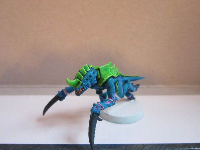
Now that we are done with the dreamer I would like to show the two tyranid color schemes I am considering for my main army and I would like your help to decide.
#1


#2

Hope you folks have a good week, I'll post more stuff soon.
~SWL
7 comments:
HAHAHAHAHHAAHAHAH. The Carebear is ADORABLE, dude. I like how it matches the Dreamer kid. It's so silly and creepy at the same time.
Btw, what was in the MYSTERY box? :D
I like the Tyranid scheme, but it's too bright for me. I like my stuff slightly more grimdark and realistic. Maybe tone it down with a watered down wash to bring it all together?
Bright and loud is my bread and butter, it's how I like to paint. Consider that bright things draw more attention than darker or muddied objects. I mean 'nids resemble bugs more often than not, and how does a bug or insect tell it's dangerous? Usually with lots of color (a few examples not withstanding from the arachnid family).
and honestly those color schemes that I showed are after I dulled the coats with a dark glaze oddly enough.
Glad you like the Carebear though, I'm going to have another join it's ranks as soon as I get it primed and painted.
and as for the mystery box, I'll give you all a hint since the winner of the first box has already been decided. Orks.
I see merits of both of paint schemes... I think I'm leaning more toward the first one, though I'd probably lower the brightness on the green of the soft squishy parts and either make the blades black like scheme #2 or choose yet a different highlight color for the sharp pointy parts.
Have you though about how the schemes translate to the bigger bugs? I had that issue myself with my first few schemes, using the gaunts I made the blades and carapace the same color, which looks funny on some of the larger bugs where carapace and blade end up beside each other.
A fair point, the scything talon in particular come to mind, perhaps where I run into those problems I might possibly make the blades darker, possibly bringing it from dark to light at the point, I could also add an extra color to the edges of the carapace on the bigger ones, thus helping distinguish the chitin from talon.
I'm leaning towards paint scheme #2, although 1 might look good with bleached bone scything talons. I dunno...I like both.
#1 looks much cleaner and sharper. Ignore Scourge. Go with # 1.
I prefer nid scheme #1. The green draws the focus of the model to the face, while #2 draws the eye away from the face.
Love the neverborn figs, but I think a little more contrast between Teddy's teeth and gums would pop a little more.
Post a Comment