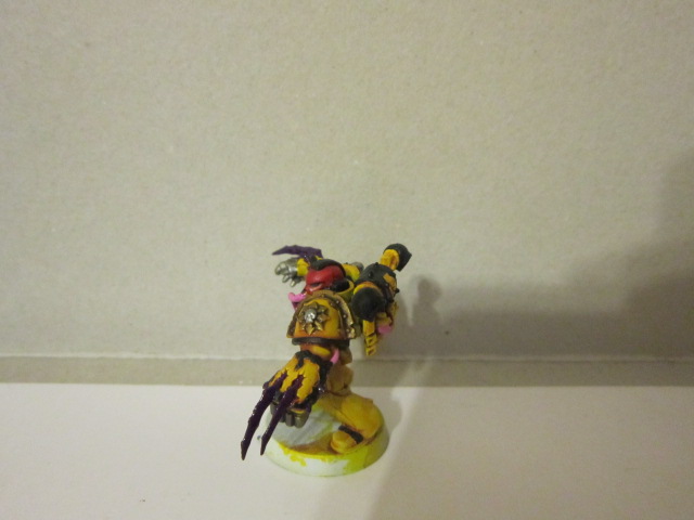
So about 3-4 weeks ago when I picked up the forgefiend (which is still in progress) I also picked up a box of the new raptors some parts of which I mixed and matched with a box of regular CSM but we'll get to that another time. Four of the raptors became Lords/Captains, and I gave two of them power swords and the other two lightning claws so they could be switched out. Though most of the time I honestly think I'll be running a lord with lightning claws.
Now it's no lie I love raptors, and almost all jump troops, something about the phrase "Strike from the skies brothers!" sounds almost magical to me. Thus I love having a massive amount of jump troops to harass the enemy early in the game I5 with the option of FNP is simply a nice icing on the cake.
I was slightly torn on how to paint these guys weapons though, as I thought too much metal would make them as characters look kinda bland. I decided to go for the classic glassy blue color, as I thought it would be nice to bring a cool color into the model. Though It was pointed out to me that I chose in doing so the three primary colors blue, yellow, and red.
That being said though I really love the design of the claws, most of them are designed very very well and produce a fear effect that I find quite nice. my main bitch about them though is the lightning bolts. I cannot properly describe the annoyance of these thin lines but I'll do my best, Imagine that you are painting on a space as large as your paintbrushes brush but you can't get a smaller one because the paint is too thin and runny. It looks neat but I would have much preferred an alternate claw without the lightning bolts.
The only other thing I realy don't like is the lack of laying with the models movement, most of them look nice, but some of the arms and heads together don't quite look well, and most of the heads have the problem of the neck joint being too short and kind of sunken into the chest cavity.
Now I felt these two looked much better than the first, in terms of movement and decided to make them white helmets (vets.) but it is worth noting that these heads were altered and not in the raptors box, The one with claws is a standard topknot CSM head which was cut off and shaved into the arrow, I having never been fond of the top knots with few exceptions (Abbadon and the fantasy Slaanesh lord being they) The other was a khorne berzerker helmet that I cut those stupid looking bunny ears off of, actually if you do this with most of the berzerker heads they look much much better IMO.
Not much I can say about this guy, he came out how I wanted, though I kinda feel I should have put a mark on his shoulder.
now I did some other converting on this guy most notably adding the sword from a Chaos knight from the fantasy line, but I think it will look pretty good should I ever decide to take a lord with the murder sword. I took a bolter from the sanguinary guard and gave it to him, though I kinda wish I had some fire effects to add to it.
So moving on from the raptors are a couple of champions I made/painted for my noise marine squads. Though I not sure how often I will be using both.
Now let me start off by saying I love this shoulder pad, it looks fantastic for noise marine dudes in general. In fact most of the paldrons with those vents that look like speakers do.
So you may be wondering why they have tongues. long story short I had these fucked up helmets, I kinda wanted to do something with them but I wanted them to look a bit more like chaos, so I drilled them out and put an elongated tongue in their place feeling it would fit the slaanesh theme.
Now I kinda like this guy, even though I'm not a fan of the X-23 thing he has going on with his version of the lightning claws, though I suppose it beats the retarded look of the wolverine claws they made for the 5th set. Not too much I can say other than that, I decided to do a royal purple here, thinking blue would look weird but I'm kinda regretting my decision now....maybe I'll change it in the future but chances are I'll leave him as is as a reminder.
Finally we come to the last painted model of this week. I struggled for a while trying to decide how I wanted to paint him, a suggestion coming my way of a family member to do him with an homage to david bowie with glam makeup.... So I did...and I think it looks pretty good.
Not much I can say that the picture does for me.
Finally the last little pit this week, a W.I.P. that might not see finishing for a little while but looks cool none the less.
That's it for this week, Hope you enjoyed it, Comments, questions and such are always welcome below, Have a great week.
~SWL


